
01 OVERVIEW
Challenge:
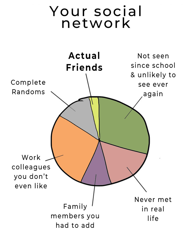
Everyone craves deeper relationships and community. I wanted to solve this because I’ve been part of vibrant communities. However, keeping these groups together is challenging since Facebook’s complex, one-size-fits-all approach has replaced simpler more appropriate structures.
Solution:
I used design thinking methodology, conducted user research, and identified key insights to brainstorm a better community app. I created wireframes and a prototype, then evaluated and iterated on the designs through usability tests.
This project preceeded the current deluge of messaging apps.
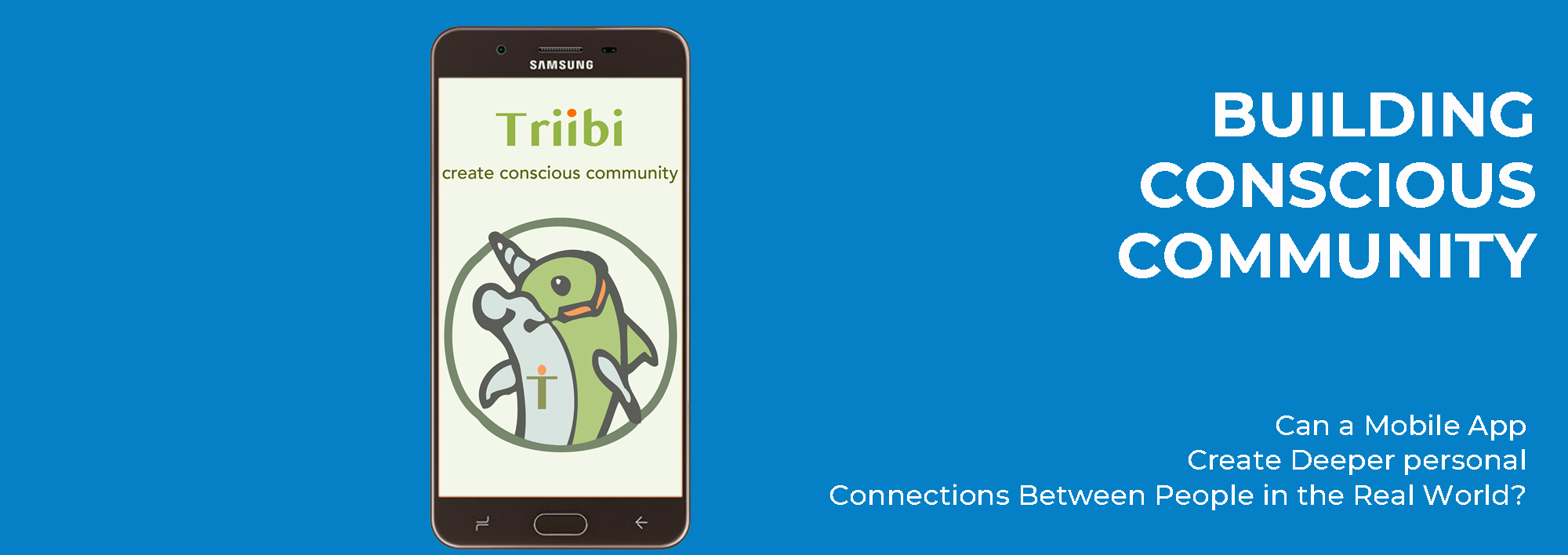
Could an App be Designed to Help Create an Epic Life by
Supporting Conscious Community Building?
02 RESEARCH
Methodology
People who have participated in or have had leadership roles in conscious communities were given live telephone interviews to share their opinions. Others were given surveys to fill out on their own. Here is a sample of what they had to say:
“…strengthening bonds, and depending on eachother…”
“some way of focusing or limiting the inputs”
“…the opportunity to help
others”
“Not like Facebook!…
see each other’s notifications…”
“…feel warmly
welcomed…”
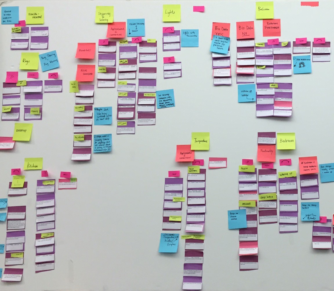
03 KEY INSIGHTS
-
Able to set limits on messages and inputs
-
Simpler than Facebook. Optimized for community
-
Not a Business App!
-
Help with participation and events
-
Wanted support network
-
Fast. Not distracting
-
Share resources
-
Analytic
Armed with this information, it became clear that ‘simple and focused’ was the way to go
…so we got to work
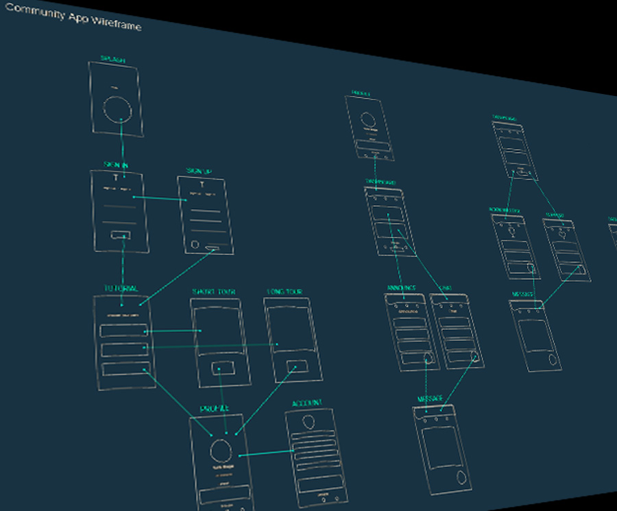
04 WIREFRAMING
Wireframes were drawn for scale and positioning.
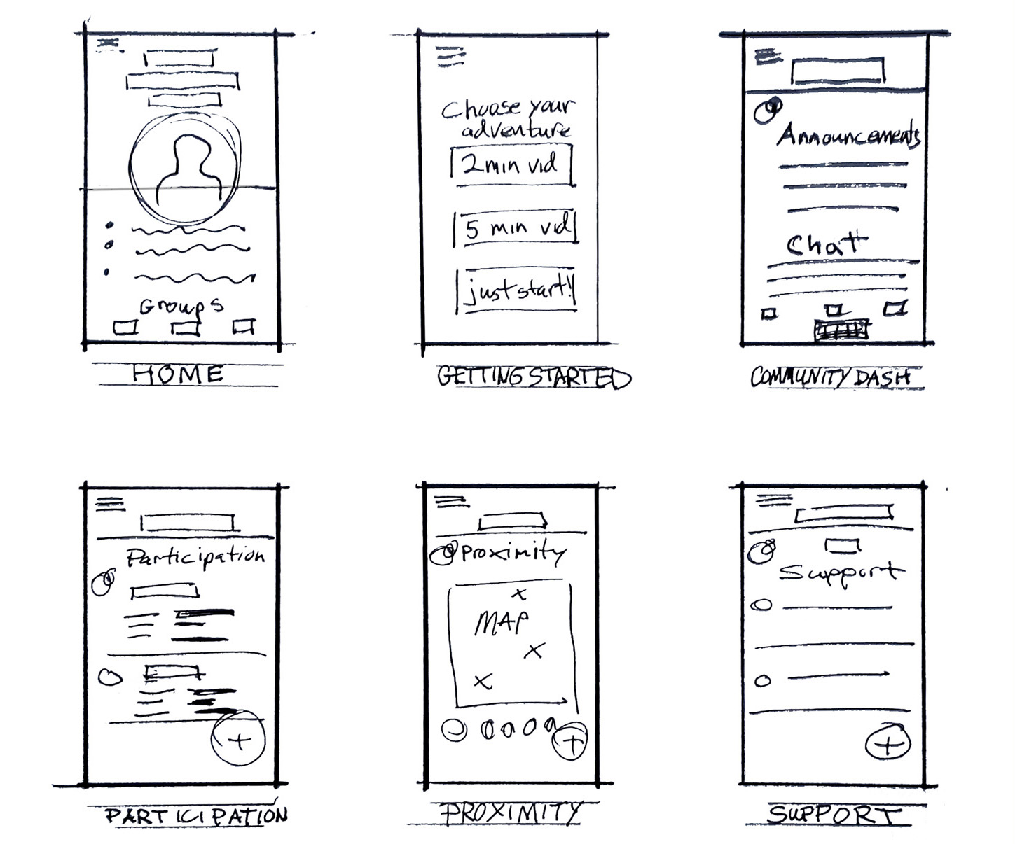
User flows were explored.
05 PROTOTYPING
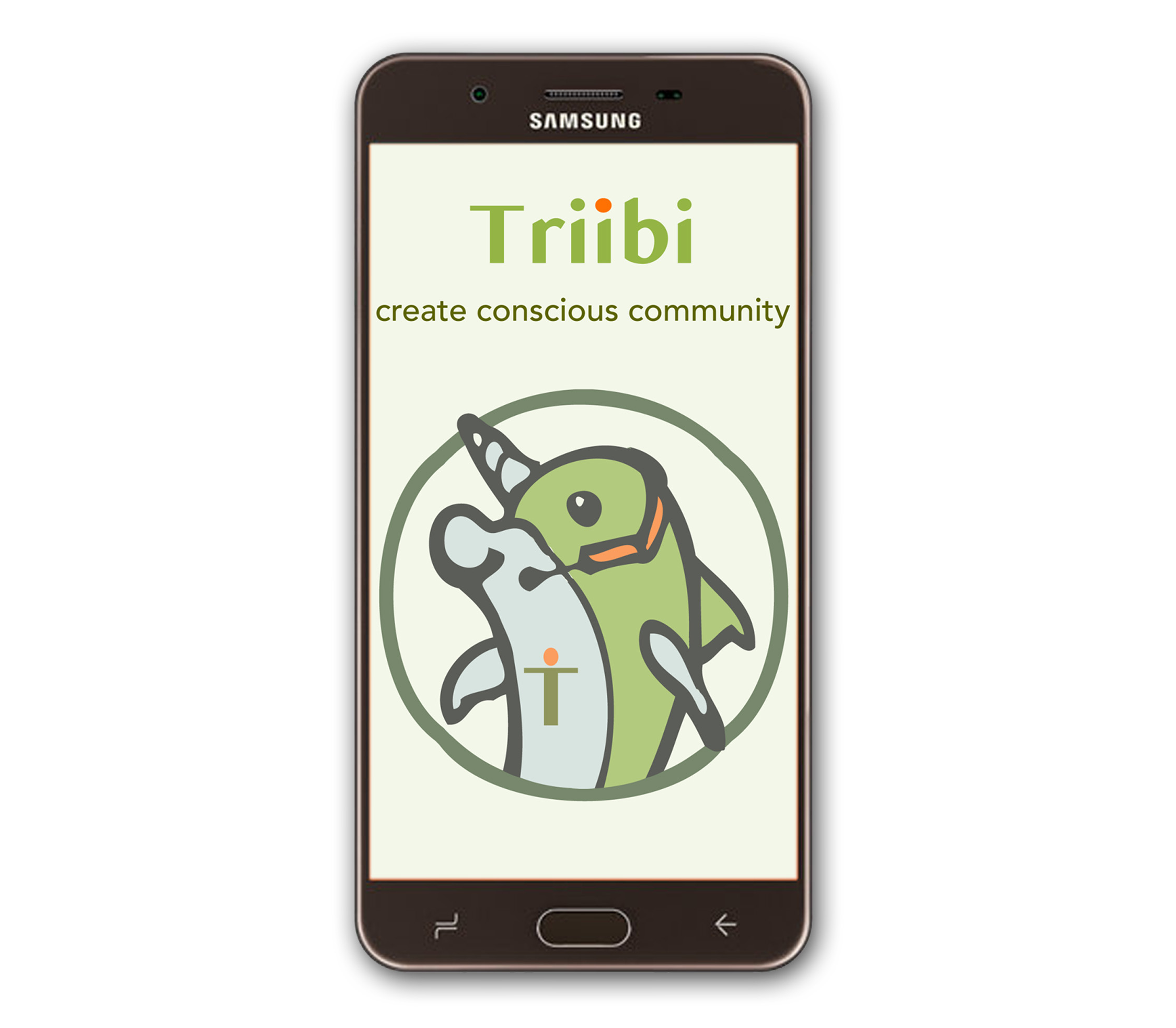
INTRODUCING
TRIIBI
Screen allows for prioritizing
information and minimizing time spent to move communication to in-person.
Users have average traffic and
other metrics to help them
decide their level of
participation.
Bracketing allows for quick scanning of messages
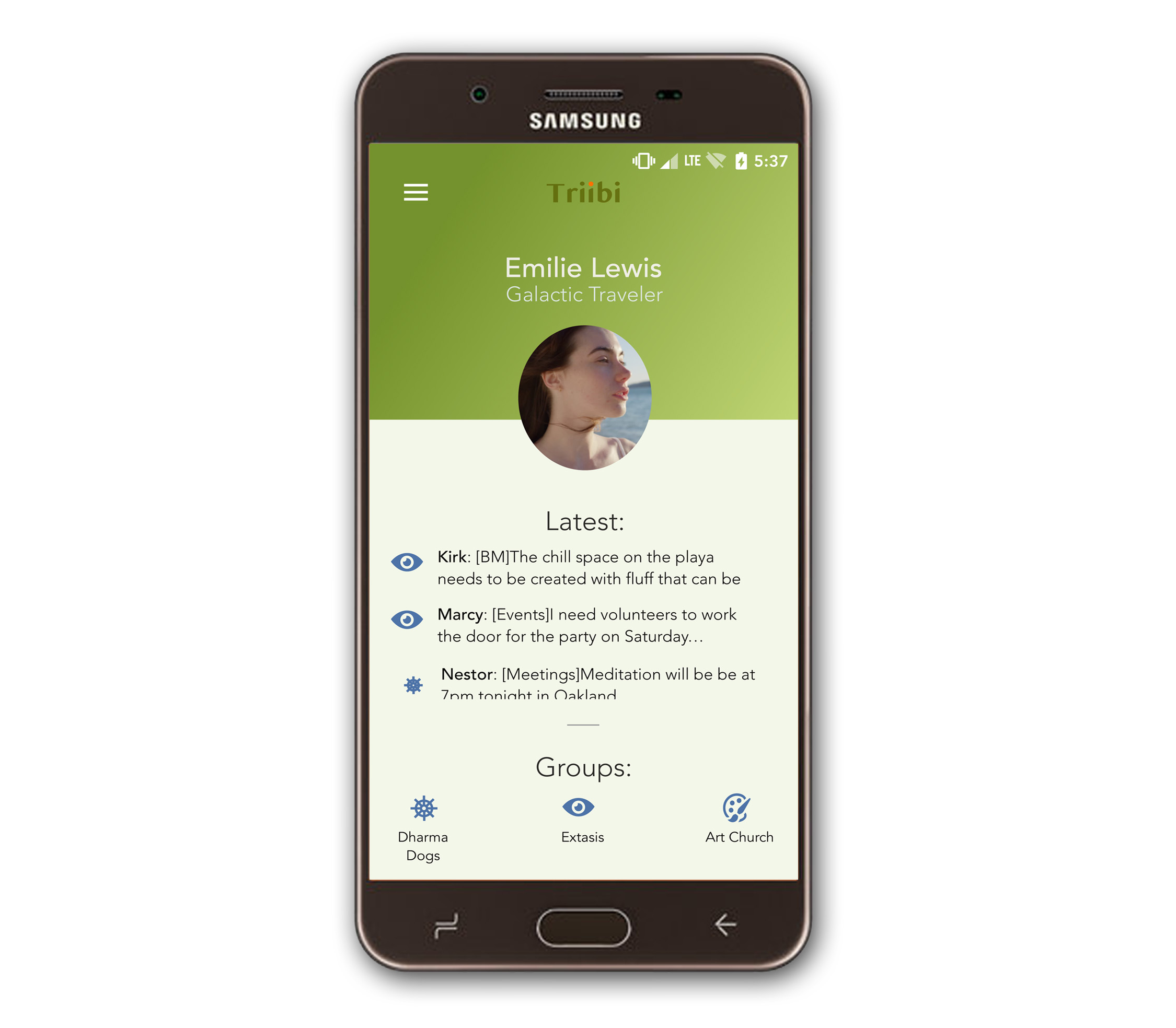
HOME
Screen allows for prioritizing
information and minimizing time spent to move communication to in-person.
Users have average traffic and
other metrics to help them
decide their level of
participation.
Bracketing allows for quick scanning of messages, and creates more intentionality around posting
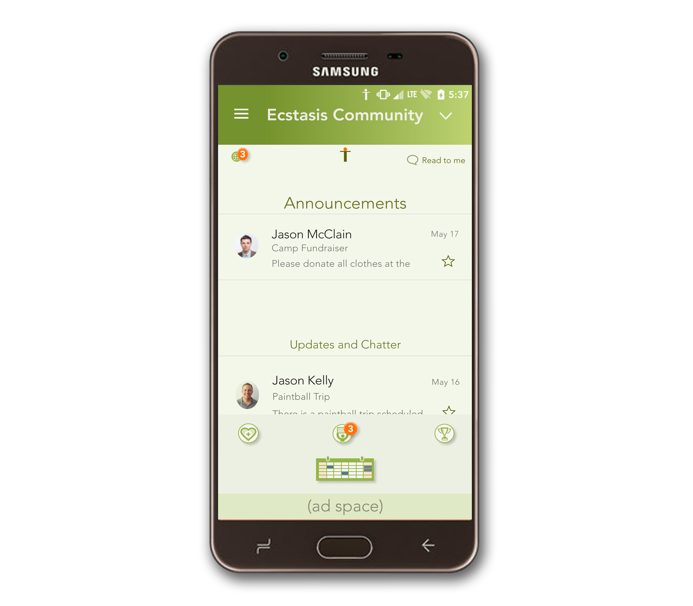
COMMUNITY
DASHBOARD
Access everything in a community in one glance. App will read you messages when you are driving or doing other things
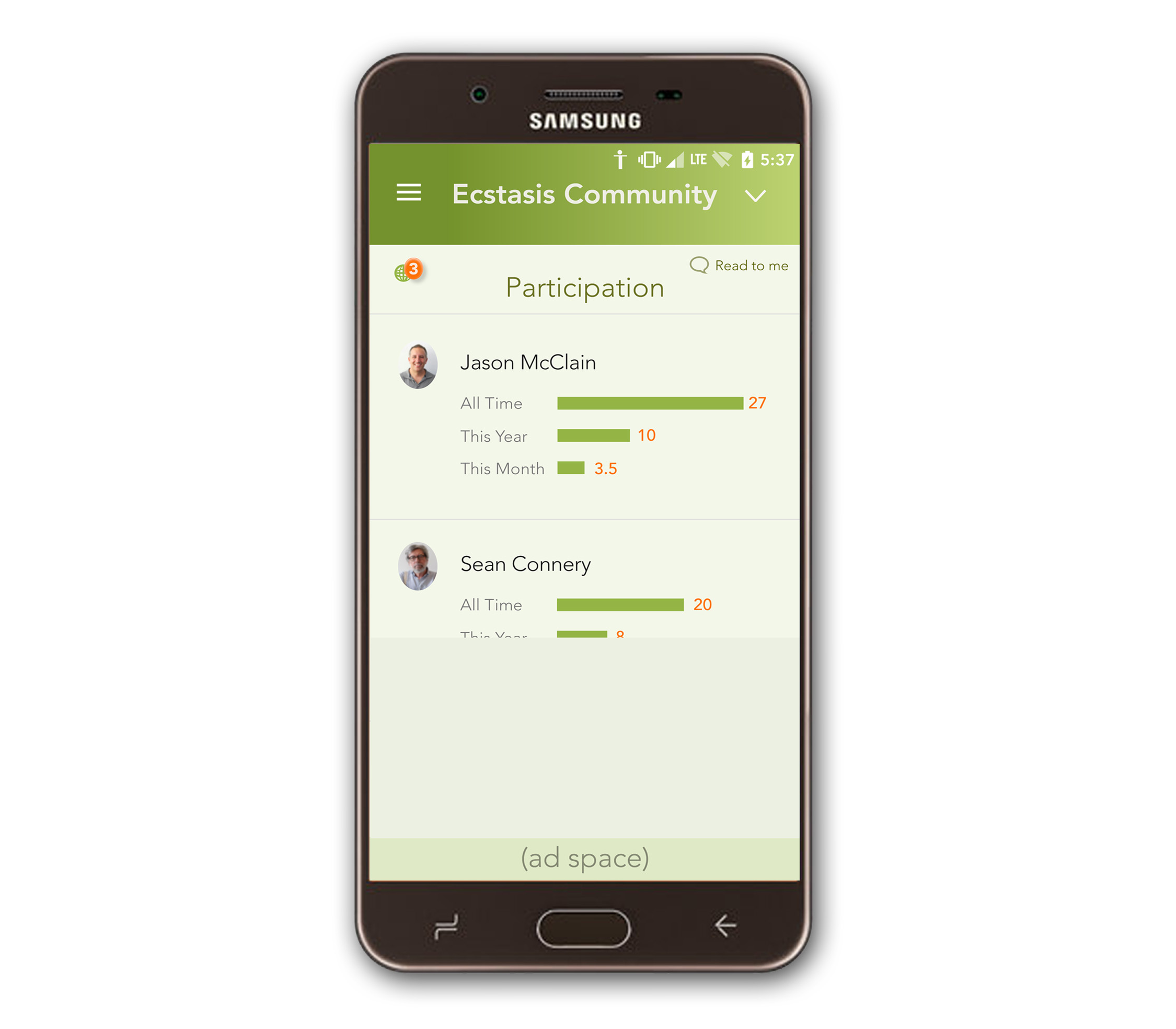
PARTICIPATION
Communities can decide to set
up a point system to
increase engagement.
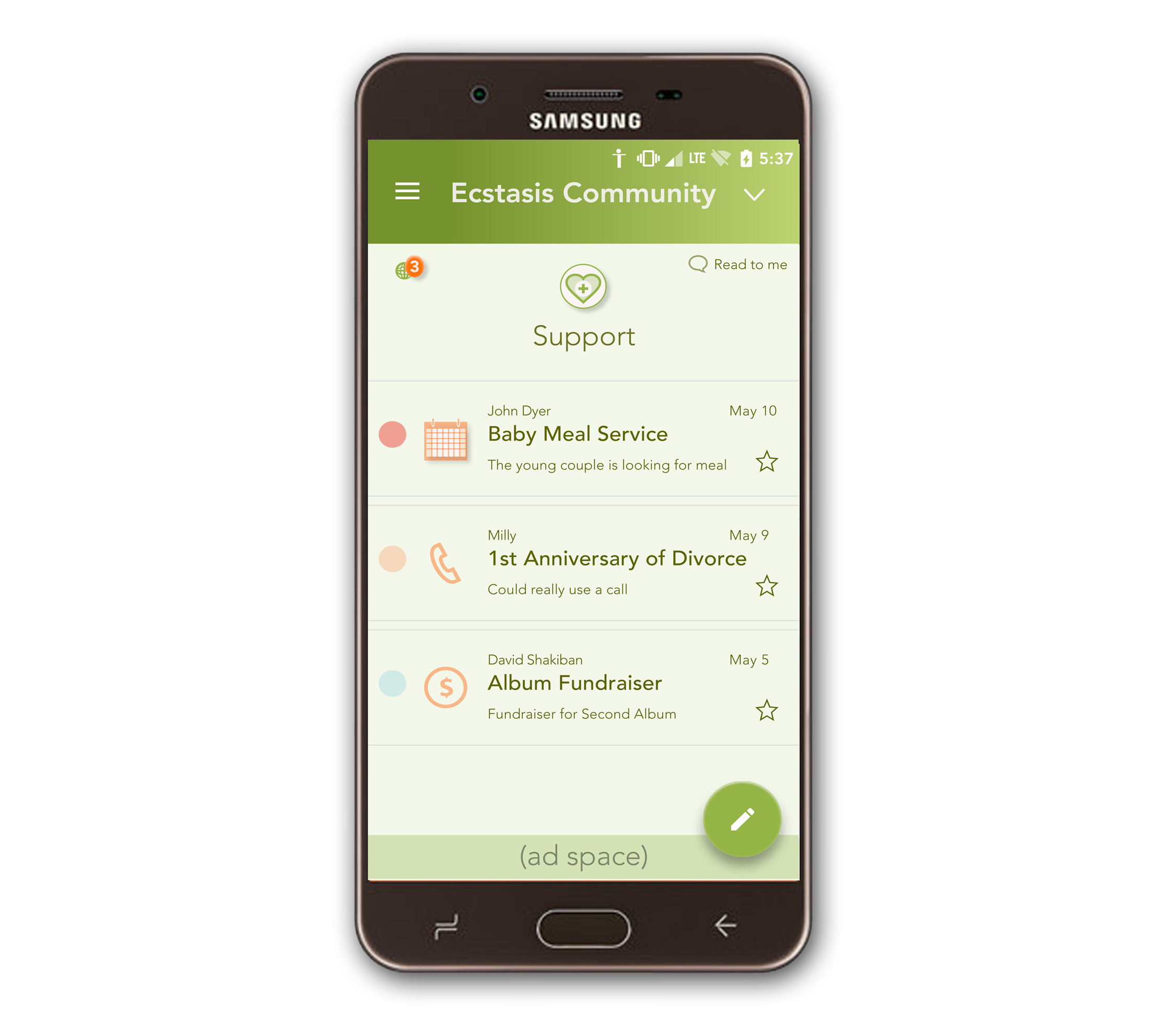
SUPPORT
When posting, user gets a
choice of different templates
suitable for the kind of support
needed
User can easily set up a support
schedule, or ask for donations,
etc.
Optionally a community may decide to award, people responding to support posts, community participation points

ANNOUNCEMENTS
AND
CHATTER
Important community
announcements and
discussions are
separated and budgets
for each can be set to
keep messaging traffic manageable.
OTHER FEATURES
Classified ads
Allows for intra-community
commerce
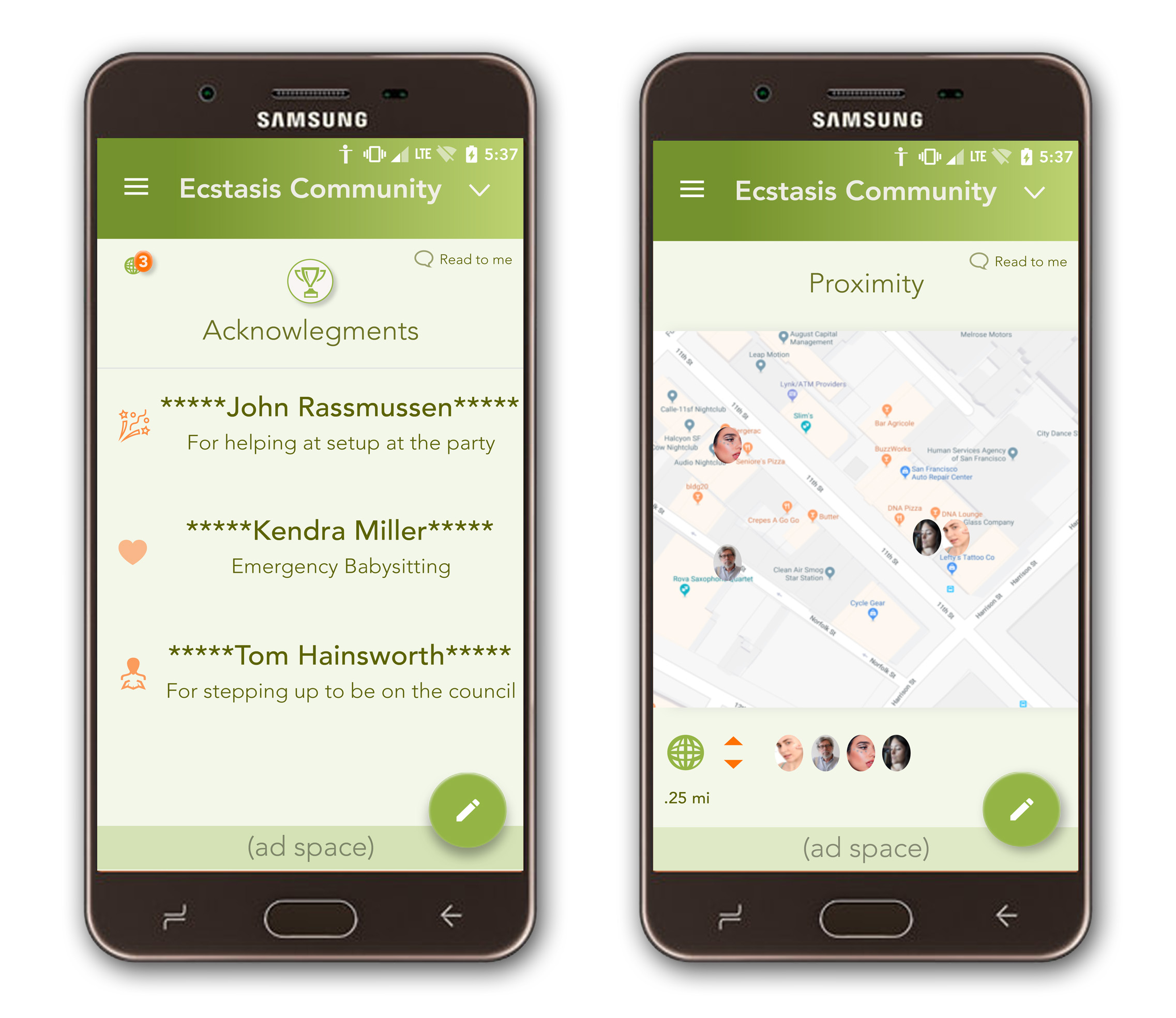
Acknowledgements
Enables members to give
kudos to other members
Proximity
Allows members to locate
other members who have
enabled GPS for meeting up
06 USABILITY TESTING
In-person usability testing was performed where a sample of vetted individuals were shown the prototype and asked to give feedback as the attempted various tasks.
What went well:
“Love it. the concept, one place for everything. planning and productivity. really like the calendar. “
“Aww… there is support! And acknowledgements! Love concept.”
“I liked proximity, liked participation. like how you can have extra groups. “
What went poorly:
“In the beginning it was confusing how to start.”
“confused when I landed on the profile of someone else”
“participation seemed lame if you had to input the information. no one will input this. maybe by proximity. would not trust a person to input.”
“don’t understand what these icons (on dashboard) are for”
07 ITERATION
CHANGES
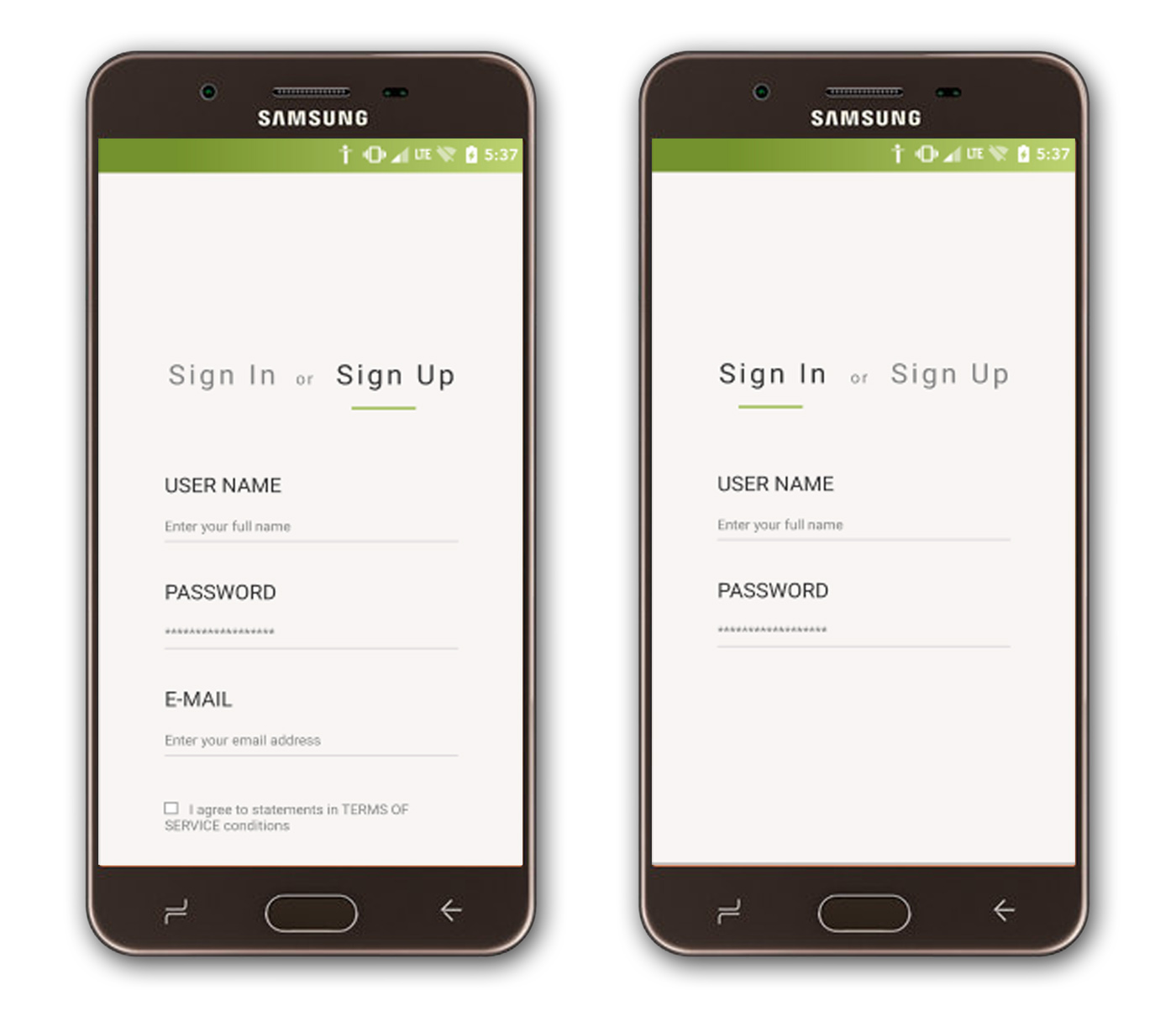
Sign-Up and Sign-In Screens were added to enhance the User testing experience
It was given a cleaner look.

Dashboard Screen was modified. Icons were made larger and a carousel scrolling function was added to accommodate options.
Higher contrast is being added for Compliance. Micro-copy to clarify each’s function is being added in the next iteration.
08 CONCLUSION
Lessons
- I learned the importance of having good documentation and taking good photos
- Don’t forget the transition screens!
- It can be helpful to create research questions that are zoomed in to you level of understanding and focus so far
- Case study and documentation can take a very long time after the fact. Best to at least keep in mind the case study while doing the project, as you will need to present it at some point
Summary
My project explores mobile app solutions for fostering deeper real-world connections. Interviews with those in robust conscious communities revealed a need for streamlined, distraction-free communication and support. I developed a focused mobile app for this purpose. Usability testing highlighted areas for improvement, such as a clearer onboarding process and a reorganized. Since my project, many messaging apps have begun to fill this space.
CASE STUDIES

EDUCATION PC AND MOBILE APP
Wireframes, User Flows, Storyboarding, Product Design, User Research, UI Design
ENVIRONMENTAL USER-CENTERED DESIGN PROJECT by IDEO
Product Design and User Research